
React Ok Tooltip
React Ok Tooltip is a simple and easy to use tooltip component for React.

Usage
Inside App.tsx:
import { OkTooltip } from '@deepdub/react-ok-tooltip';
import '@deepdub/react-ok-tooltip/dist/tooltip.css';
function App() {
return (
<>
{/* insert app here... */}
Then, inside Component.tsx:
import { tooltip } from '@deepdub/react-ok-tooltip';
function Component() {
return (
Options
Tooltip Options
tooltip() method accepts two parameters: title (a string) and options (an object of shape TooltipProps).
TooltipProps may include any of the follwing:
- subtitle:
string- A subtitle that will appear, well, below the title. - maxWidth:
string- A string, passed to the tooltip'sstyle.maxWidth.
All are optional.
Global Tooltip Options
Customize the tooltip by passing any of these to
- arrowSize:
number- The size of the arrow. - backgroundColor:
string- The background color of the tooltip. - borderColor:
string- The border color of the tooltip. - delay:
number- Tooltip delay in milliseconds (default: 1000). - className:
string- Will be passed on the to tooltip itself. - arrowClassName:
string- Will be passed on the to tooltip itself.
All are optional.
Tooltip Group
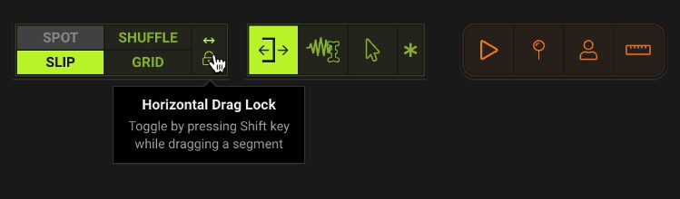
React Ok Tooltip also supports a concept we've called "tooltip group".
A tooltip group lets you anchor multiple tooltips to a single element (as shown in the GIF above, when the cursor hovers the middle section).
Usage
import { tooltip } from '@deepdub/react-ok-tooltip';

function Component() {
  return (

  );
}